
PAM App
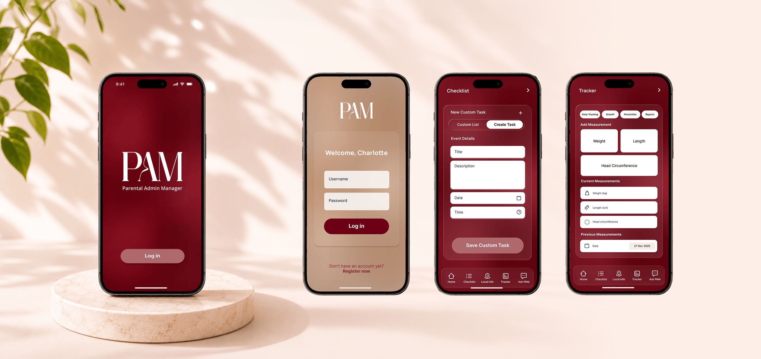
PAM (Parental Admin Manager) was created in order to make everyday life a little easier for new parents, helping them navigate the demands of parenthood with a simple, user-friendly app.
The project called for a fresh creative direction, creating an intuitive interface that balanced functionality with a distinctive visual style. The goal was to deliver a seamless, stress-free experience for busy new parents who need things to be straightforward.
PAM wanted to challenge the typical look and feel of parenting apps, moving away from the playful colours and childlike visuals associated with the category.
Instead, we focused on a rich, sophisticated colour palette and premium aesthetic that felt modern, considered and distinctly grown-up, without compromising on simplicity or ease of use.
Full Project Scope
As a new mum herself, Oly, the founder of PAM, came to me with an app idea inspired by her own experiences of navigating parenthood.
While she had a clear vision of what she wanted to achieve, she wasn't quite sure how to bring it to life. Combining creative consultancy, concept development and design, I helped shape her initial idea into a clear direction and bring her vision for PAM to life.
-
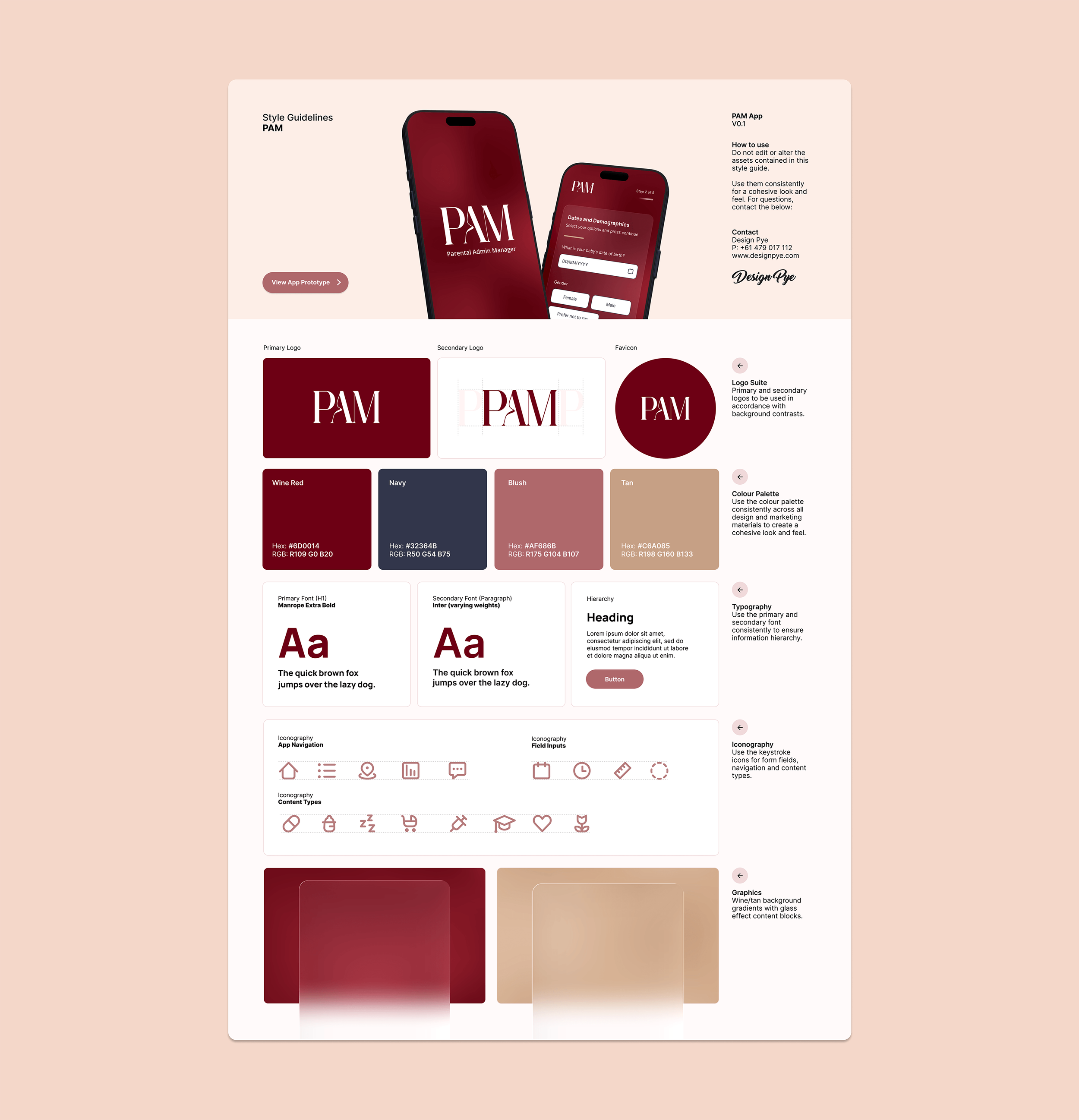
Custom colour palette and visual design system developed to establish a warm, calming and accessible brand and interface that builds trust with new parents.
-
The design of key app screens, creating a clean, intuitive experience that simplifies everyday parenting tasks and information management.
-
Interactive high-fidelity prototype created to demonstrate complete user flows, validate the experience and communicate functionality before development.
-
Comprehensive style guide documenting typography, colours, components and UI patterns to ensure consistency throughout the product and future development.
Got your own idea for a new app?
Get in touch to turn your idea into a real prototype.